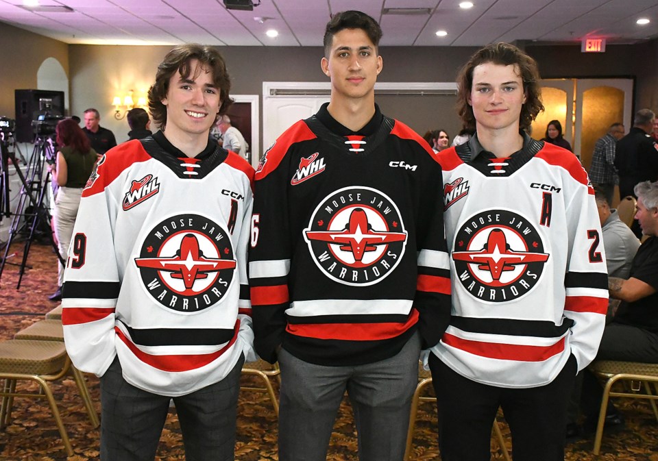
The Moose Jaw Warriors have officially entered a new era.
The Western Hockey League franchise unveiled a brand new primary logo and jerseys during a special press conference at Grant Hall on Tuesday morning, marking the retirement of the headdress logo the franchise had used since the 1988-89 season.
“It’s an exciting day for the organization and the city of Moose Jaw and we’re excited for the new era,” said Warriors general manager Jason Ripplinger. “I think the new logo is great and our front office and (designers) Rock and Bloom did a great job. Obviously, we’re very honoured with our roots with the Snowbirds, the Royal Canadian Air Force and 15 Wing.”
The new logo is circular in design and features an in-flight Snowbirds jet in front profile with Moose Jaw written above and Warriors below.
The unveiling included a special video presentation highlighting the attachment between the Warriors and Snowbirds, with several members of the 431 Air Demonstration Squad on hand to check out the final design.
“It’s pretty awesome to be included in this,” said Snowbirds commander Lt. Col. Denis Bandet. “We’ve had a relationship with the Warriors going on 12-plus years now, and having the Warriors as an honorary Snowbird organization as well is pretty special. Seeing the development and everything come to light is pretty exciting.”
The Warriors announced a review of the primary logo in October 2020, with many discussions with regard to planning and design taking place in the lead-up to Tuesday’s announcement. That included discussions with the Snowbirds themselves, who had some input into the design.
“It started off with some informal discussions to grow community spirit, and as the relationship grew, it evolved into this,” Bandet said. “In the discussions we’ve had some communication with the RCAF about what we wanted to do, then seeing how the Warriors included aviation and 15 Wing into the spirit of the community is pretty special.”
The design process started quickly after the Warriors made their logo review announcement, with Rock and Bloom -- a Saskatchewan-based design studio -- approaching the team soon after.
“They gave us some ideas, we told them what we were looking to do and we ended up getting more ideas from them,” Ripplinger said. “It was a long process, and we were patient making sure there wasn’t anything we were rushing into.”
As both Ripplinger and Bandet touched on, the design makes sense given the close relationship between the two organizations -- in addition to their annual ‘Snowbirds Night’ featuring specially designed jerseys, the Warriors have a ‘home-and-home’ with the Snowbirds each season. Members of the flight team will take part in a scrimmage with the WHL crew, and in exchange, players spend a day at 15 Wing learning about the squadron, culminating in a handful taking to the air for a special demonstration flight.
Now, that relationship is that much closer and stronger.
“The PPCLI have the Regina Pats and now the Snowbirds have the Warriors,” Bandet said with a grin.
Warriors forward and Moose Jaw Minor Hockey product Atley Calvert was joined by teammates Brayden Yager and Max Wanner in modelling the new logo and the black-and-red-and-white jerseys they’ll wear in the 2022-23 season.
“I like it, it has a little bit more going on than last year and I’m excited for the new jerseys and the new logo,” the 19-year-old forward said. “I think it’s a good turn and I’m excited for the new season.”
The headdress logo replaced a First Nations individual riding a skate in the 1988-89 season before undergoing a script change in 1996-97 and a colour alteration in 2002-03.
The Snowbirds logo will act as the primary crests on all jerseys going forward, with the snarling moose logo -- now grey in colour with red eyes -- serving as the secondary patch and main logo on alternate jerseys.
You can check out a special video announcing the new logo by visiting www.takeflightmj.ca.


